
Logo created for Kokomo Winery’s new “Drink Pink Society” wine club
Logo created for Kokomo Winery’s new “Drink Pink Society” wine club
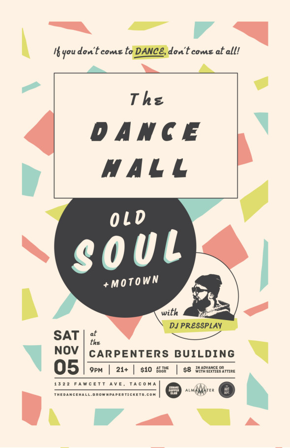
Tacoma, you need to dance.
You need to get up off your seat, put on your dancing shoes and go make a fool of yourself. Dance like no one’s watching. Dance like you’re the center of the universe. It’s good for the body. It’s good for the soul. It’s been a long time coming and we promise it’s gonna be so worth it!
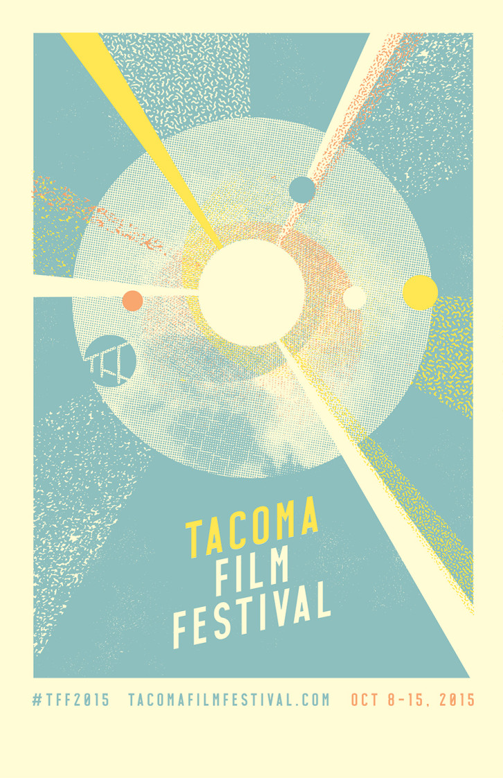
Coming in October, Tacoma Film Festival 2015 is shaping up to be another excellent one—and we were honored to have the chance to once-again provide the poster art above!
Here are some artboard scraps and details from the process: (more…)
[portfolio_slideshow id=2287]
We had the distinct honor of working with the beloved Northwest Folklife Festival this year to create their 2014 branding and poster.
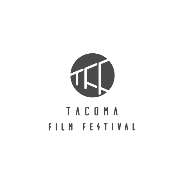
Inspired both by a cone of light from a projector as well as a strip of segmented film, we created this clean, simple logo as a timeless piece of identity for Tacoma Film Festival.

Somewhere down in the beaches of Los Angeles lives a surfing, film-editing woodworker who travels the world gathering pieces of wood and designing and crafting custom high-end furniture. His artistic pieces breathe with life and personality.
And we had the privilege of creating a logo and identity for him that would serve as a fresh face for his work as well as a functional brand for his pieces.
![]()

![]()

We continue to work with the good folks at Artist Home on their successful TIMBER! Outdoor Music Festival as it puts on its coziest winter coat and becomes TIMBRRR! Winter Music Festival (see what they did there?)
The poster we designed above takes its cues from the summer festival’s poster we designed, but with a much more chill effect (we hope!) and all still centered on a modified version of the TIMBER! logo we designed. (more…)


The Art Dept. has gone global.
The Spain-based translation firm Interllingua was embarking upon a brand re-boot and asked us to help them through the process.
With the creation of their logo, we immediately found ourselves playing with concepts of translation. Real language translation moves beyond just interpreting words—it truly interprets meaning.
To this end, we designed a logo that incorporated graphic elements with a double meaning—quotation marks altered to resemble speech bubbles:
![]()
We placed the open quotes below the name and the closed quotes above so that the “speech” almost seems to travel through Interllingua and come back out again—the same, but transformed. This speech bubble motif was additionally carried out in their letterhead and business card:


We also worked with them to distill their promotional goals into a clearly-written, engaging, visually interesting brochure and Web site.


The site was duplicated and translated into the five other languages. Interllingua will be able to continually update and evolve the content on their site through their interactive blog and social networking features.

We’re excited to see where their new identity and marketing tools take them!
![]()
We at The Art Dept. love food. Even more so now that one of us is pregnant. And we’re really digging this food truck and street food revolution happening up and down the West Coast. Truly amazing chefs are putting their hearts and souls into these accessible mobile marvels for the masses.
So, when our friend Jace—the musician behind one of our favorite NW bands Fort Union—approached us to create a logo for his brand new Portland food truck, he had us at “fried.” Our creative juices began eagerly flowing (along with a fair amount of saliva.)