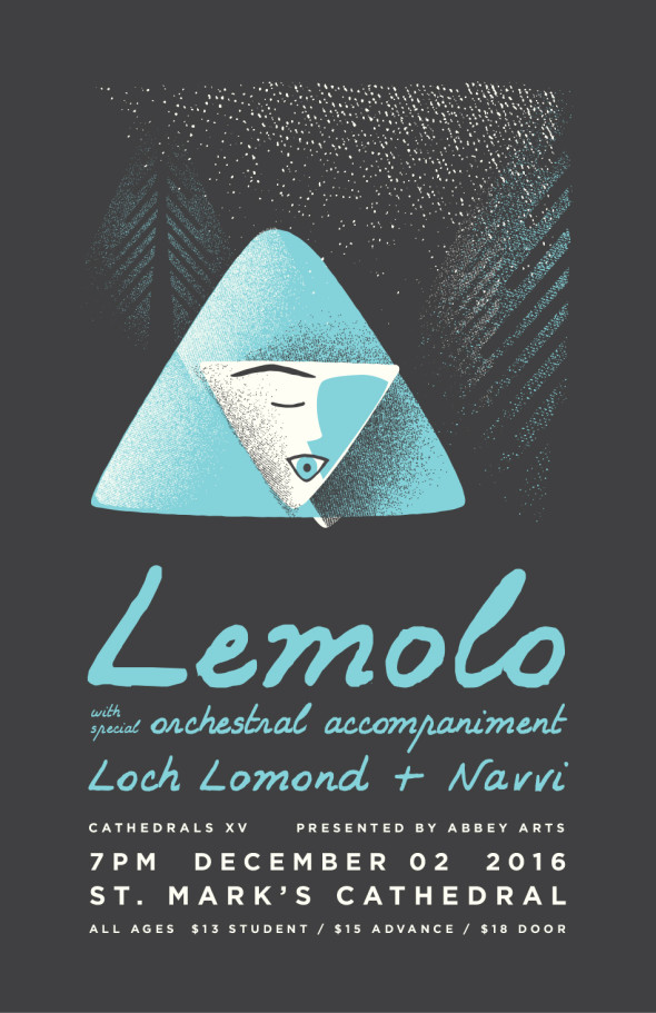
Our friends Lemolo will be headlining a very special winter’s evening concert—Cathedrals XV. We had the honor of creating the artwork for the poster!
Our friends Lemolo will be headlining a very special winter’s evening concert—Cathedrals XV. We had the honor of creating the artwork for the poster!
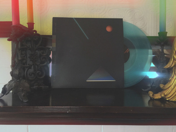
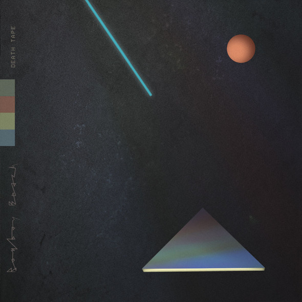
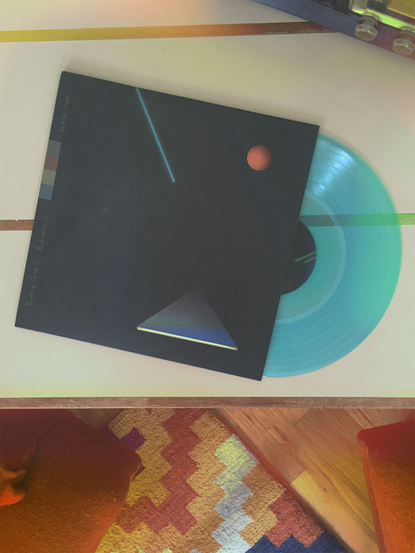
While we’ve created album art before, we have to admit that this is the first time it’s been produced for 12″ vinyl—and we have to say unboxing this was one of the most thrilling things we’ve done lately. We can’t deny we’re in love with this artwork for Bombay Beach‘s debut album—but not as much as we love the music contained inside. Have a listen and order your copy today at their website.

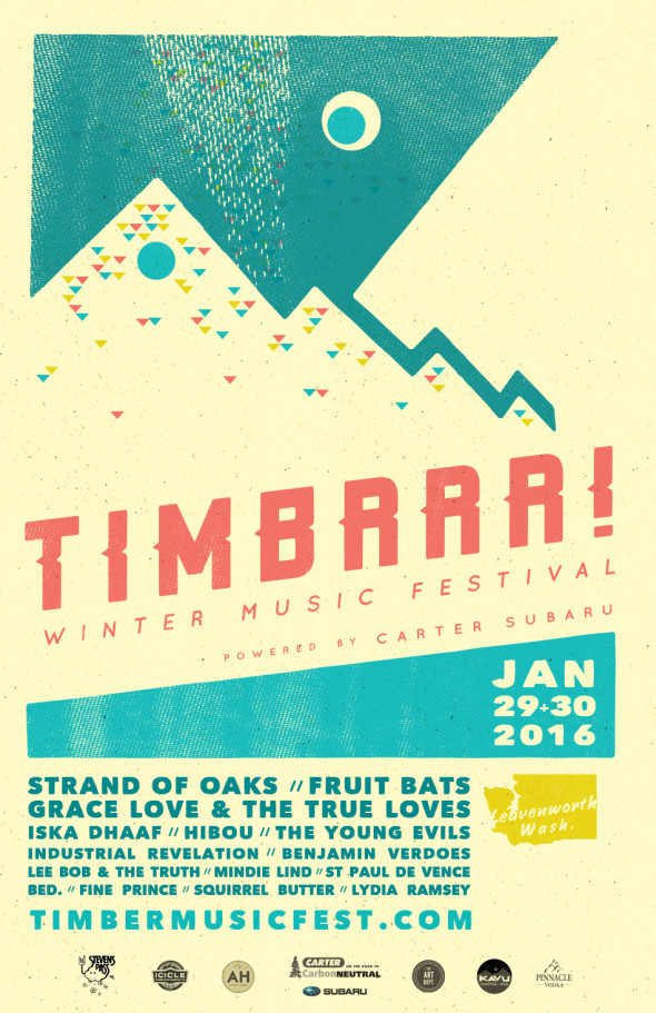
Once again, we had the opportunity to create the artwork and design for this year’s TIMBER! Outdoor Music Festival—see you there?
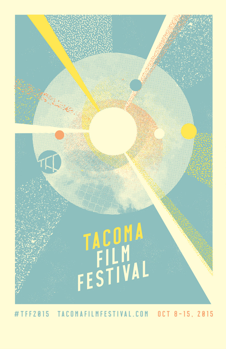
Coming in October, Tacoma Film Festival 2015 is shaping up to be another excellent one—and we were honored to have the chance to once-again provide the poster art above!
Here are some artboard scraps and details from the process: (more…)
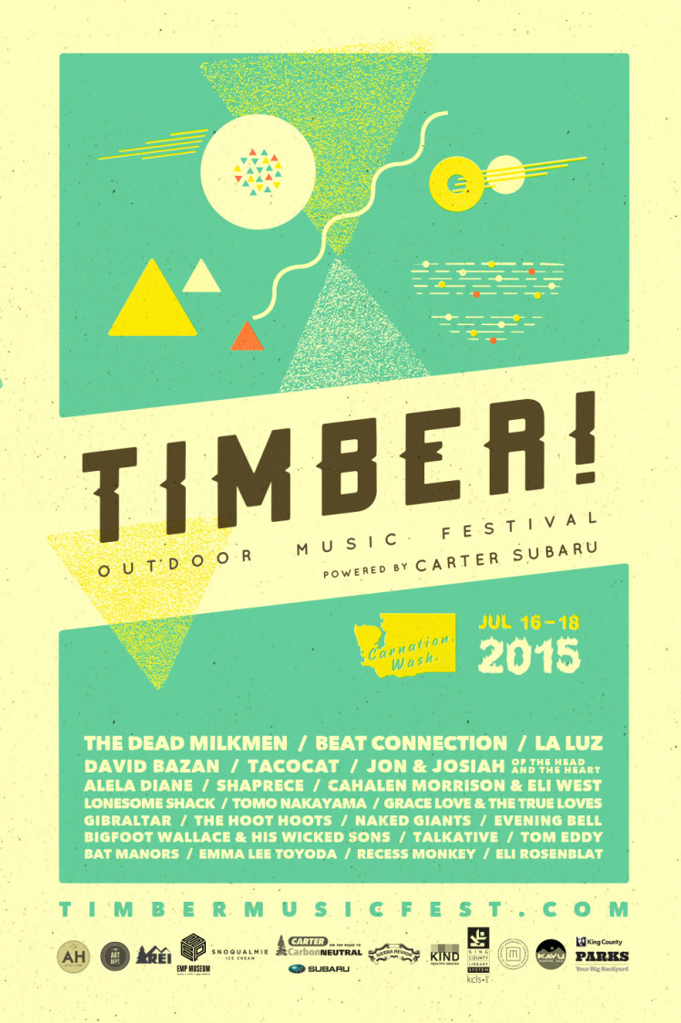
Presenting the poster art and design we created for the 2015 Timber Outdoor Music Festival.
Campsite, here we come…
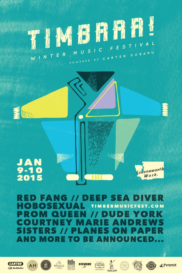
Original poster art for another fantastic music festival—music, snow, and more music in the Bavarian-rich Leavenworth, Wash. There’s some heavy hitters on this bill and all in a really unique setting.
Tickets are currently on sale at the festival’s site (be quick—they sell out!): timbermusicfest.com
[portfolio_slideshow id=2246]
Here’s the poster we created for the 2nd annual TIMBER! Outdoor Music Festival. Take a look at those headliners!
We wanted to catch the vibe of swim trunks and boat sails and tent flaps and starry nights and forever blues. We’re already mentally there . . . hope you’ll join us in July!
Tickets on sale at timbermusicfest.com.

This is the poster we designed for the 2013 iteration of the annual Squeak ‘n’ Squawk music festival in Tacoma, Wash. If there was a squeaking and squawking animal that was the festival’s mascot, this would be one of its feathers.
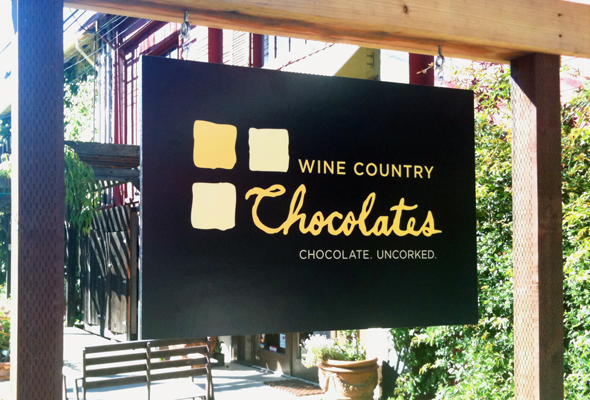
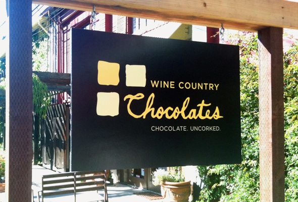
We recently had the distinct pleasure to work with the gals at Wine Country Chocolates to help them create a new logo that better expressed their unique, gourmet, hand-made chocolates.
You can see the tasty new logo above on their brand new sign outside their Jack London Village location in Glen Ellen, CA. We look forward to seeing the logo take over their boxes, packaging and other materials.
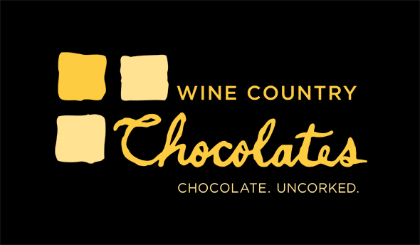
Our design director Mary found a way to carry over their yellow and black checker pattern used in their previous logo (see the image below:)

However, she freed the checks from their formalized placement by giving them an imperfectly-edged, handmade look just the way their one-of-a-kind chocolate truffles appear. She also made “Chocolate” the focus of the logo while (with the help of Ms. Esme Johnson’s handwriting) giving it an almost drizzled look—almost as if it were written in chocolate sauce. Don’t you just want to take a bite out of it?
If you haven’t tried their truffles before, be sure to stop into one of their locations for a mind-blowing treat. We highly recommend “The Elvis” in all its peanut-buttery and banana-y goodness.
And if you have tried their truffles before, don’t you think it’s time for a second helping? Or a third? Or a fourth . . . ?